View in Room
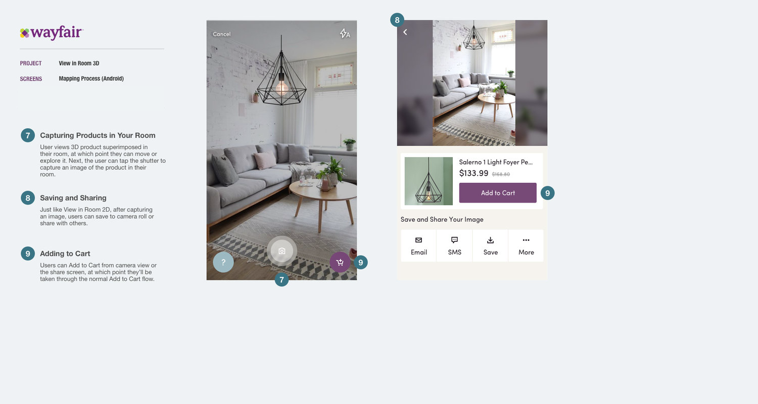
"View in Room 3D" is an enhancement of Wayfair's "View in Room" core app feature. It allows users to "try products out" before making a purchase decision by superimposing a to-scale, 3D product image into their room. Users can walk around and manipulate these 3D models, which have been created with care by Wayfair engineers, giving them an even more realistic idea of how product appears in their home.
Product Designer @ Wayfair
User research, UX and UI design, Documentation
July 2018 - August 2018

Objective
We made a number of improvements to the MVP of View in Room, but the goal of this project was to enhance the user's experience using augmented reality and 3D models.
Competitive Analysis (below)
Similar features were either complex (ie: product appeared in room to-scale, with dimensions), while other 3D models didn't appear to scale, leaving room for error/guessing on the user's part
Because users didn't always recognize what they could do in the View in Room MVP, tool tips like the ones used by Houzz were something we wanted to explore
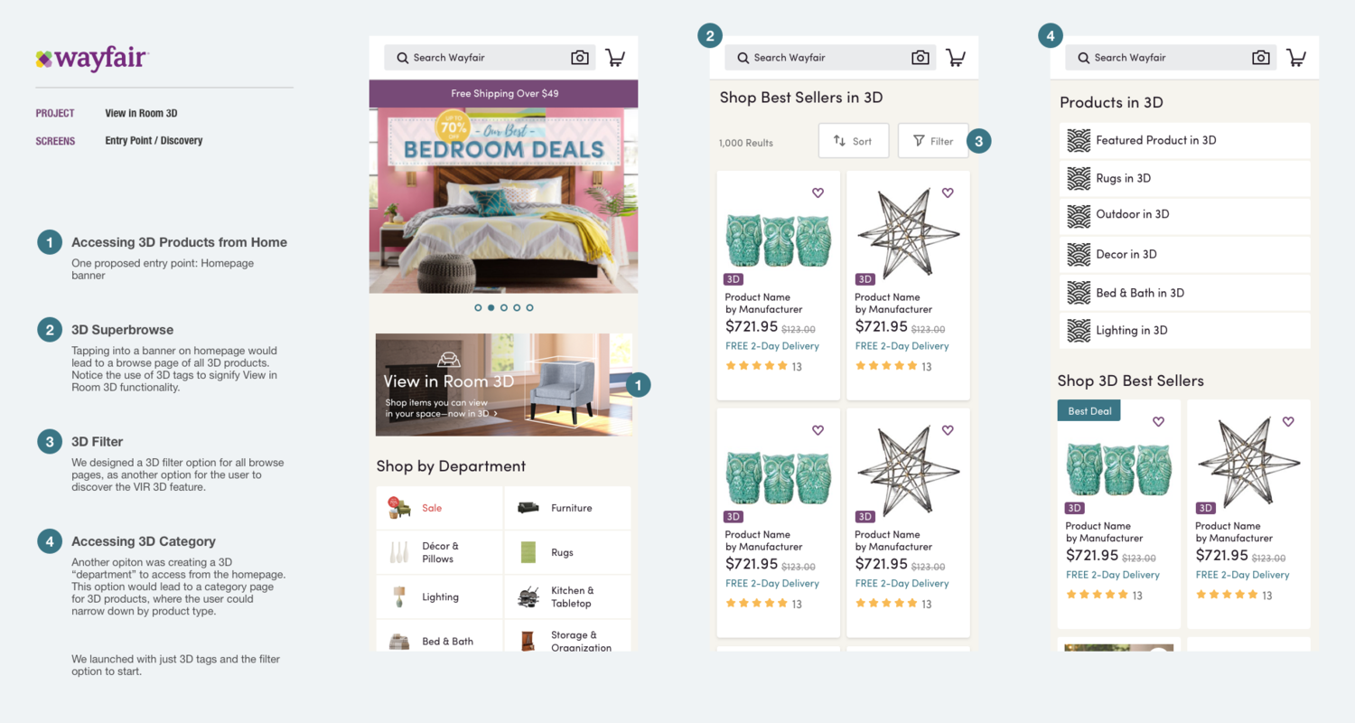
Competitors like Houzz utilized filters as an entry point and tags on product cards to indicate the feature; other competitors like Overstock used a homepage banner to launch users into the experience
We landed somewhere in between in our final design
Process and Opportunity Areas
The View in Room 3D feature operated similarly to the 2D version, however, there were three unique challenges to address with the 3D version:
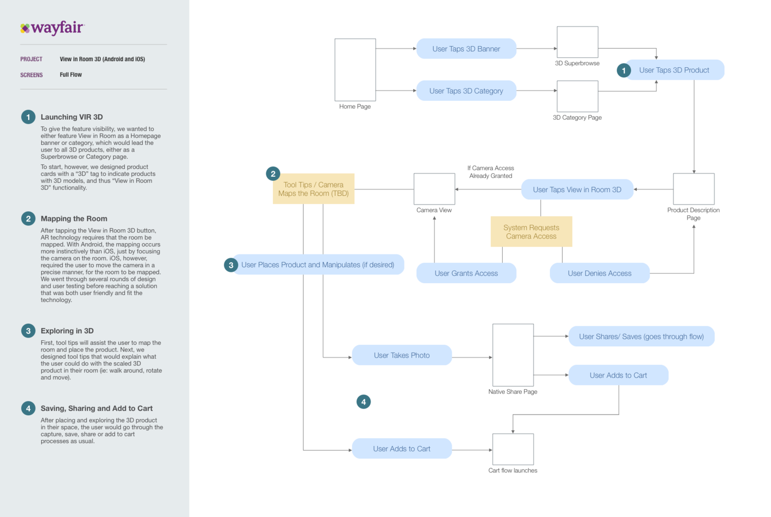
Entry point: with the 2D version, we relied on Wayfair's "What's New" modal (and later banners) to promote the feature. With augmented reality and 3D models being so useful to consumers in this space, we wanted to give the feature more prominence, thus designed two possible entry points: a homepage banner or making 3D products a category of its own. These entry points will best test for future states, but for now, we designed product cards tagged with "3D," alerting the user that particular products have 3D functionality.
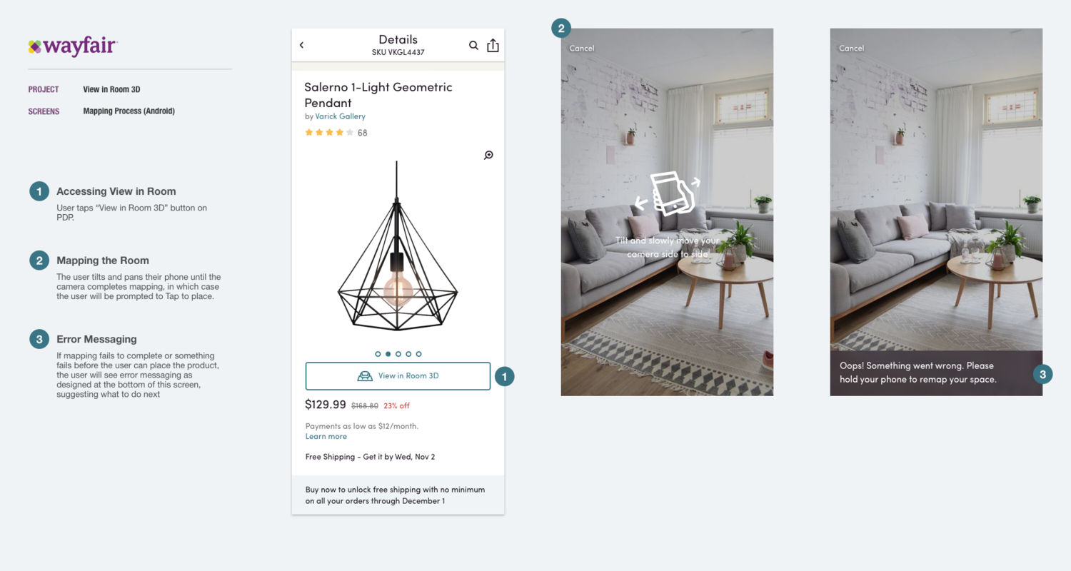
Mapping: We began designing first for Android, but with iOS in particular, it was challenging to design and accommodate the AR technology. These issues are addressed in the visuals below.
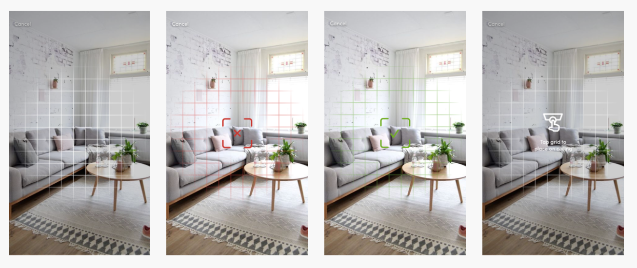
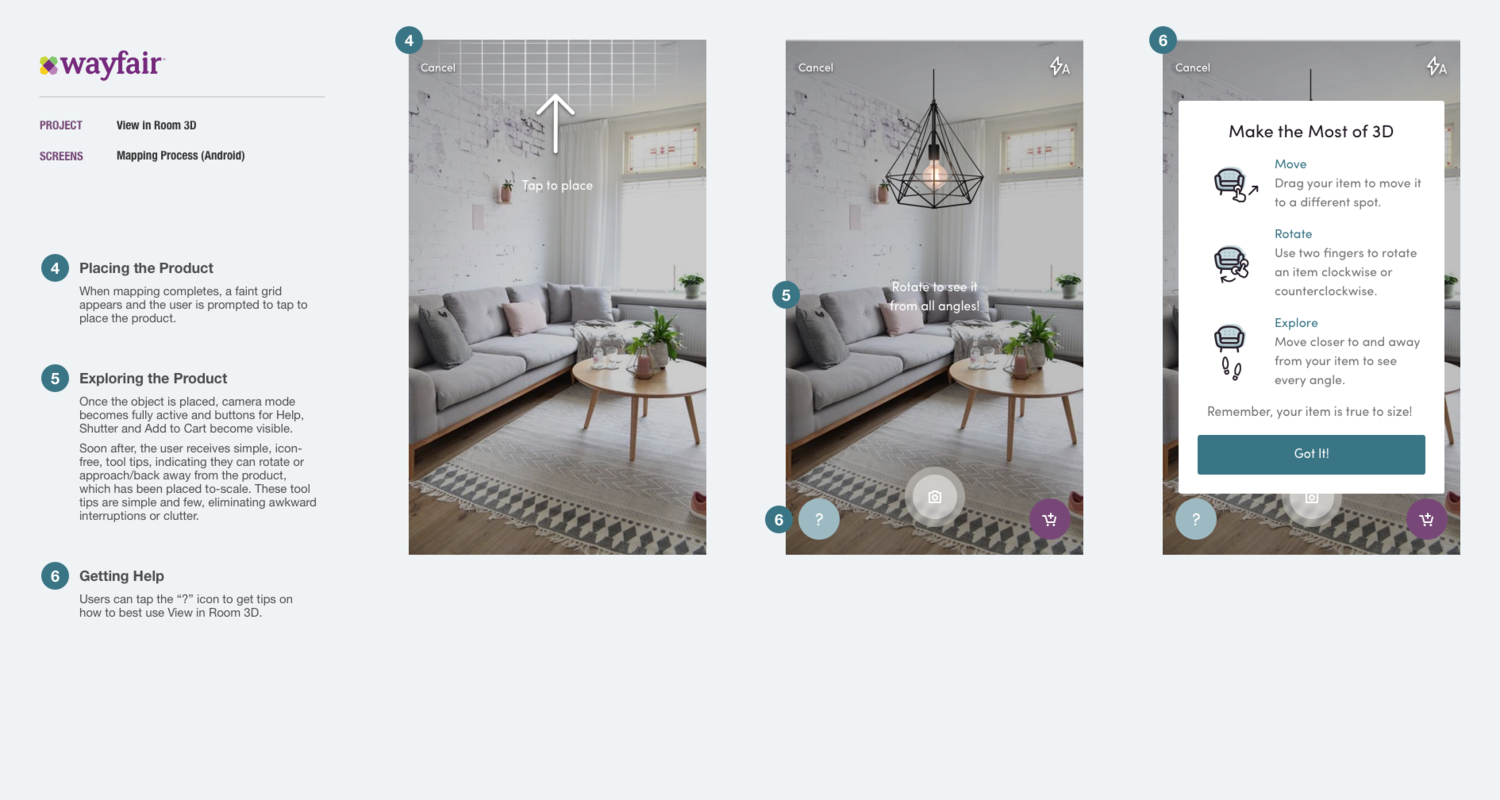
The technology required first moving the camera around to map the space, then the user tapping to place the product. In initial iterations, we used a grid visual to indicate when mapping was or was not complete. We also indicated where the object would be place according to object type and surfaces detected (see ceiling icon below).
Ultimately, the combination of grids, color and icons was too complex, while indicating where the object would be placed was unnecessary.
We worked earnestly with the developers to understand what the user needed to do to effectively map the space. This took many rounds of design solutions. One direction seen below was our attempt to gamify the mapping experience by prompting the user to line up shapes, ultimately making a diamond-like motion with their device.
We eventually shifted to error messaging in a dark bar and simplified the "Tap to place" messaging to simply an icon and text.
Final Direction
Ultimately, we learned the motion necessary for mapping was a simple tilt and pan motion. After yet more iterations of icons and visuals, we landed with the direction below.
While messaging was helpful to teach the user how to manipulate and explore the 3D models, we pared the tips all the way back to just a few text lines at the top of the screen, avoiding awkward interruptions and poor timing.


